Brand
Using Erin's name and mark
For directories, referral partners, press, and anyone making something with the practice's name on it. Everything here can be downloaded and used as shown.
The name
Erin Cervelli
The practice is Erin Cervelli Therapy. In running text, write Erin Cervelli, AMFT, APCC on first mention and Erin after that. On the site the name is set in small capitals with the credentials beside it:
Erin CervelliAMFT | APCC
Anywhere the practice is advertised, including directories and social profiles, California's licensing board requires the registration numbers, the supervision, and the employer to be visible. Use this line exactly:
Erin Cervelli, AMFT 160381 | APCC 21643
Supervised by Traci Freeman, LMFT #122329
Employed by Whole Health Counseling
Don't shorten it to "therapist" without the credentials, don't add "LMFT" (she is an associate, supervised), and don't call the practice a counseling center.
The mark
A heart of water and a rising sun
One line-drawn mark, in three colourings for three grounds. Download the one that suits the background you're placing it on. Each is a 512-pixel transparent PNG.

The primary mark. On cream or white.
Download PNG

On light photographs or pale grounds where gold would vanish.
Download PNG

On navy or any dark ground.
Download PNG
Do
- Give it room: clear space on every side at least a quarter of the mark's width.
- Keep it at least 32 pixels tall on screen, 10 mm in print.
- Pair it with the name set in small capitals, as in the site header.
Don't
- Recolour it, add a shadow, a gradient, or an outline.
- Stretch, rotate, or crop it.
- Put it over a busy photograph; use a plain ground or the bone version on navy.
- Use the older yellow-and-green version from the previous site.
The photograph
Erin, as she appears on the site
Three photographs from the same 2026 session. Use them uncropped where you can, or crop from the top so there is room above her head. No filters. Please don't use older photographs from other sources alongside these.
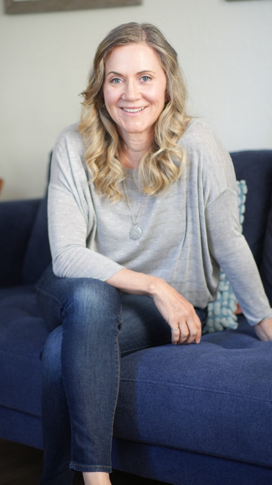
899 × 1600 pixels · Used on the home page. The default portrait for anything that needs one.
Download JPEG
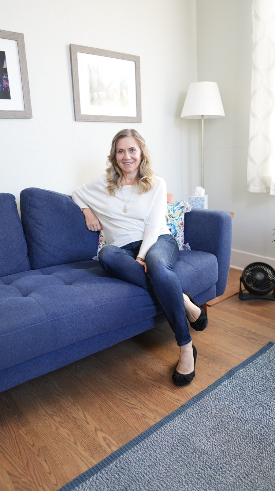
899 × 1600 pixels · Used on the About page.
Download JPEG
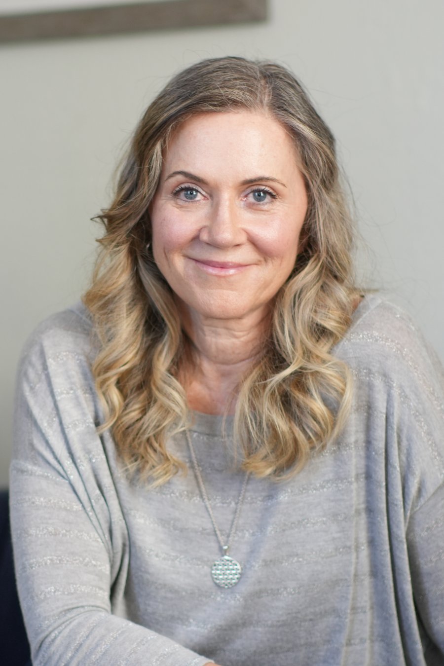
900 × 1350 pixels · Tighter crop for directories and profile pictures.
Download JPEG
Colour
Navy, gold, and cream
Deep navy for weight, warm gold for detail, cream for air. Most of any layout should be cream; navy is for headings and the occasional solid band; gold is for rules, line icons and small labels, never large areas.
#1b3a5c Headings, the name, buttons. The anchor colour. #14293f Darkest ground, behind video. #2d5074 Button hover, the coastal closing band. #bfa450 Rules, line icons, the logo mark. #d6c97a Small headings on navy. #ece4c0 Quiet text on navy. #8a732e Uppercase labels on light grounds. #fbf9f5 The page. Never pure white for large areas. #f4efe6 Alternating sections. #f1ece3 Cards and quiet bands. #e3dccf Hairlines and borders. #4a4c50 Body text. #63666b Secondary text. Type
Cormorant Garamond and Lato
Two free typefaces from Google Fonts. Cormorant Garamond for headings and the name, Lato for everything that has to be read at length.
Therapy for life's most transformative seasons.
Cormorant Garamond Light (300) for headings. Medium (500) for the name in small capitals. Regular (400) italic for pulled quotes. Get it from Google FontsAdolescence brings a lot of change at once. What do you wish someone understood?
Lato Regular (400) for body text. Bold (700) for buttons and the small uppercase labels, letter-spaced. Get it from Google FontsSharing the site
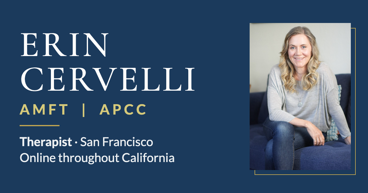
The preview image
When a link to erincervelli.com is pasted into a message or a social post, this is the picture that appears. It's attached to every page automatically. If you need it on its own, for a directory banner or a post:
LinkedIn cover
Sized for a LinkedIn profile banner (1584 × 396). The name sits right of centre so the round profile photo, which LinkedIn places over the bottom-left corner, doesn't cover it. Two colourings; use whichever suits the profile photo.